
Swiftic
Small businesses were giving up before they published an app
Swiftic let a café, a salon or a pizzeria build its own mobile app with no code: a menu, a loyalty card, coupons, push notifications, published to both stores. By 2020 the product had years of features and no single design behind them. More than five button styles, pages that led nowhere, stock imagery that made every app look generic, and store rejections because the generated apps did not meet design guidelines. Users were losing trust in a product that was supposed to make them look professional. The company brought me in as its only designer in June 2020, and I stayed until April 2023. At the center of that contract was an 18-month redesign to make the platform trustworthy again, from the landing page to the published app.
What had to be true
- ✓ A non-technical owner can get from the homepage to a published app without opening a support ticket.
- ✓ One design system behind the website, the builder and the apps it generates.
- ✓ Fewer submissions bounced by the stores for design reasons.
The call I made
Eighteen months is long enough to redesign everything and short enough to lose everyone's patience. The order of the work mattered more than any screen.
Start with the research, not the redesign
The new app templates were already out. When the redesign began, I spent its first months talking to close to 100 users and reading through the support tickets before drawing anything. The pain points sorted themselves into four groups: copy and trust signals, visual consistency, decision-making clarity from homepage to conversion, and broken navigation. That list became the backlog, and it meant every later argument about priority had evidence behind it.
Instead of: redesigning the screens the team already complained about, which would have fixed the symptoms we could see and missed the ones users wrote in about.
Ship visible wins before the system
Phase one was the parts users touched every day: dead ends fixed, real imagery instead of stock, building on the new app templates. Phase two was the website redesign and the component library. Showing value early rebuilt trust inside the team and with users, and it bought the patience a design system needs.
Instead of: one big-bang redesign at the end of the contract, which nobody could have reviewed with me as we went.
What I built
The platform had three surfaces: the marketing site, the builder dashboard, and the apps it generated. All three now share one system.
One design system, from more than five
Buttons went from five-plus styles to a primary and a secondary. Typography, color and spacing were standardized, the icon library was cleaned up, and every component was documented so two developers on two platforms built the same thing.
A website cut to what sells
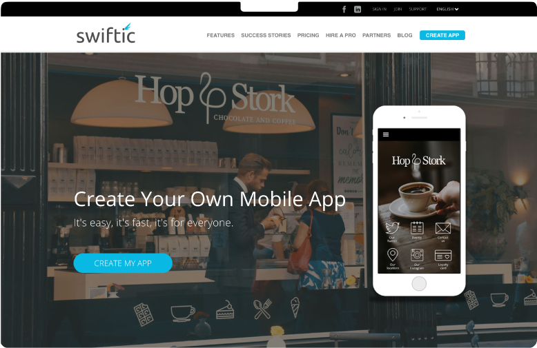
Dozens of marketing pages became five: homepage, case studies, pricing, contact, blog. The homepage now explains the product in one scroll and has one job, leading the owner to create an app.
Wireframes and flows for every core area
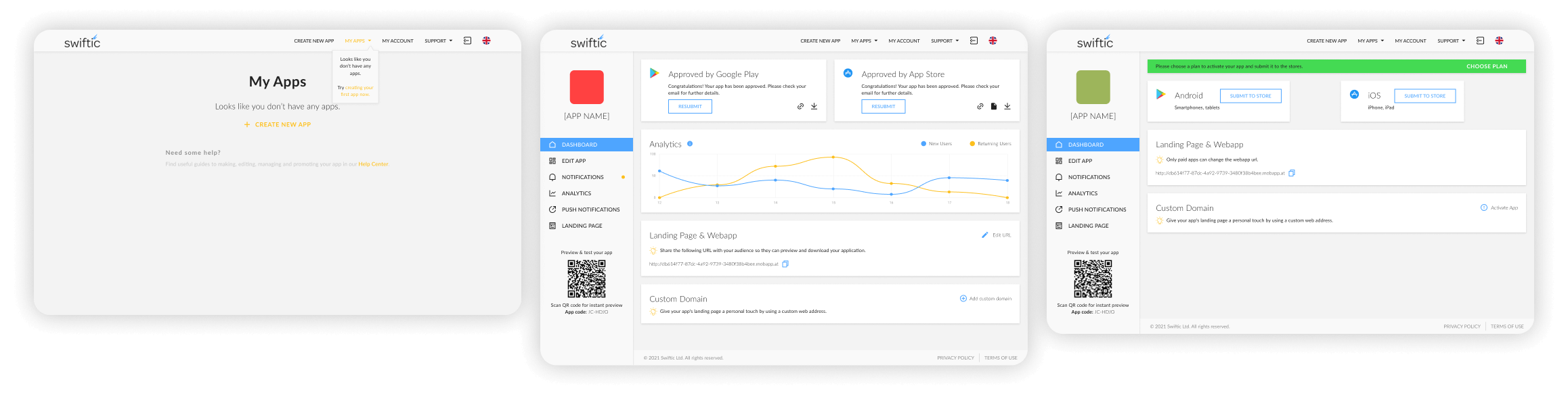
Landing page, sign-up, the builder, publishing. Each flow was mapped end to end so there were no more pages leading nowhere, and the publish step surfaced the store requirements before submission rather than after a rejection.
Working across a language barrier
There was no project management system, and one of the developers and I did not share a language. I over-communicated with visuals: annotated flows, every state spelled out frame by frame, and a weekly sync with the product manager as the single point of truth.
What shipped
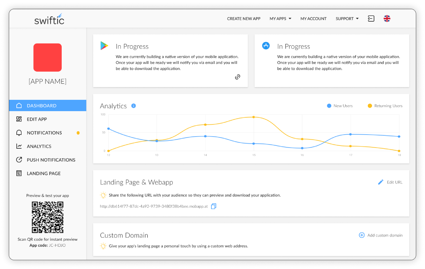
The builder dashboard and the generated apps, used by small-business owners who set things up once and came back to publish updates.
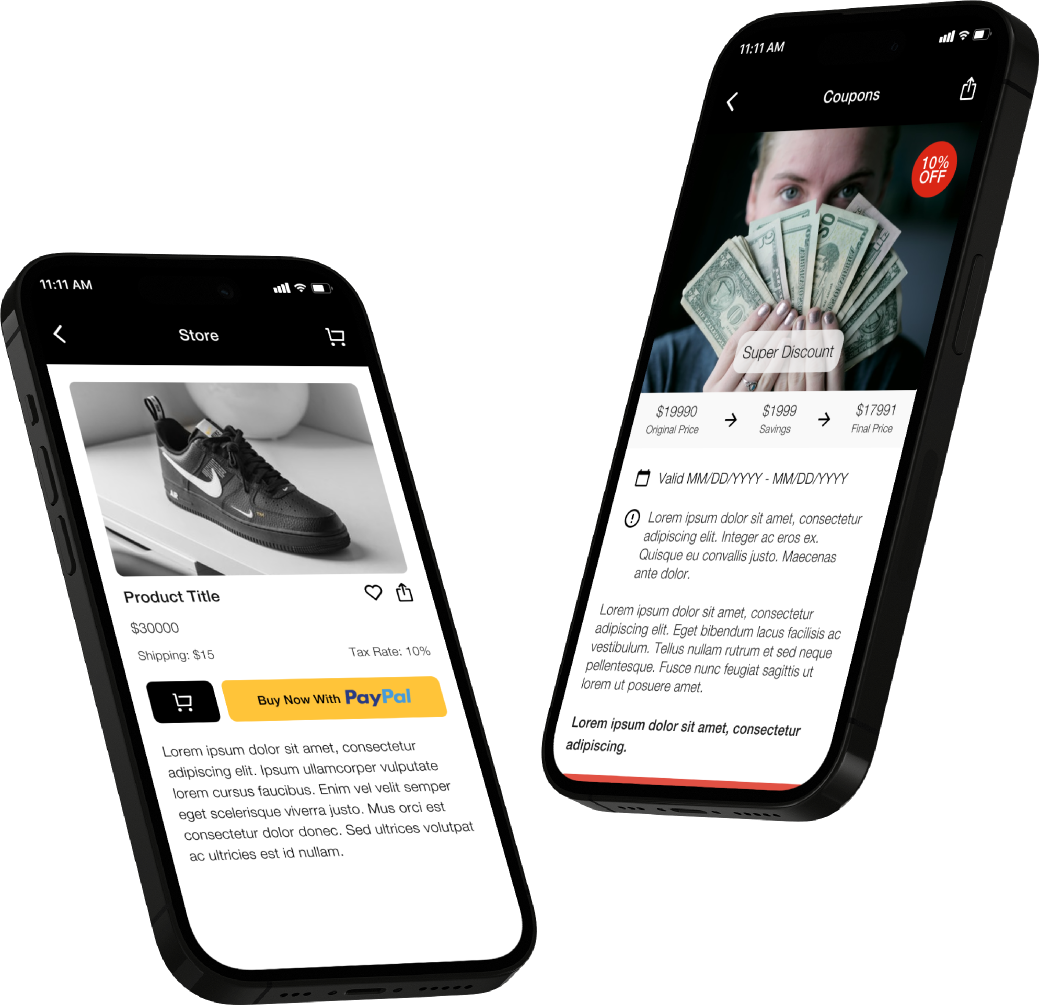
The brand and the product
Swiftic's brand was already set; the job was to make the product live up to it. I kept the energetic blue and the yellow highlight, gave the primary button a hard drop shadow that moves on press so the feedback feels physical, and set everything in Lato for warmth and legibility. The brand did not change. The number of ways it was expressed went from many to one.
Almost three years, not only the redesign
The redesign is the story here, but it was one part of the job. As the only designer, I covered whatever the company needed designed.
The app templates came first
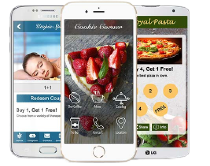
My first work for Swiftic was a new set of templates for the apps the platform generated. I designed them hand in hand with the iOS developer and the Android developer, working through each template on both platforms.
Email marketing
I designed Swiftic's email marketing alongside the product work.
Everything else a small team needs
Day-to-day design across the product and marketing: the steady stream of requests that never makes it into a case study.
What happened
Fewer support tickets about app submission
Measured on tickets tied to the submission step after the redesign shipped, against the period before it.
Acquired in 2023
The company was acquired the year after the redesign and the team was integrated into the acquirer. The product has since been retired, which is why there is no live link.
What I took from it
Swiftic was a small team with systemic problems. The job was less about screens than about how everything connected, and it is where I learned to sequence work so a team sees value before the system is finished.