
EverSafe
Booking a first-aid class should not feel like an emergency
EverSafe runs certified, in-person CPR and first-aid workshops in Dubai for parents, caregivers and organizations. The business and the platform launched together: the whole idea was that people would find a course, pick a date and pay online, so brand, site and booking system had to arrive at once. First aid is bound up with panic and worst-case moments, so the product had to do two things at the same time: make the subject feel manageable, and let a parent book in one sitting, usually on a phone. I was brought in for the whole thing: the identity, the booking experience, and the WordPress build the client would run afterward.
What had to be true
- ✓ A parent can go from Book Now to a paid place in four steps, on a phone, without messaging anyone.
- ✓ The client can add courses, dates and venues without a developer.
- ✓ Every touchpoint reads as calm and credible, never alarming.
The call I made
The brand is what people remember, but the booking flow is what the business runs on. It was designed first, and the identity was built to serve it.
Make booking the product, not a brochure
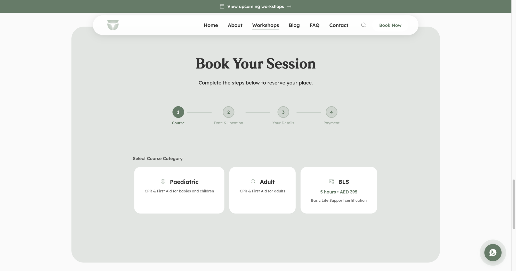
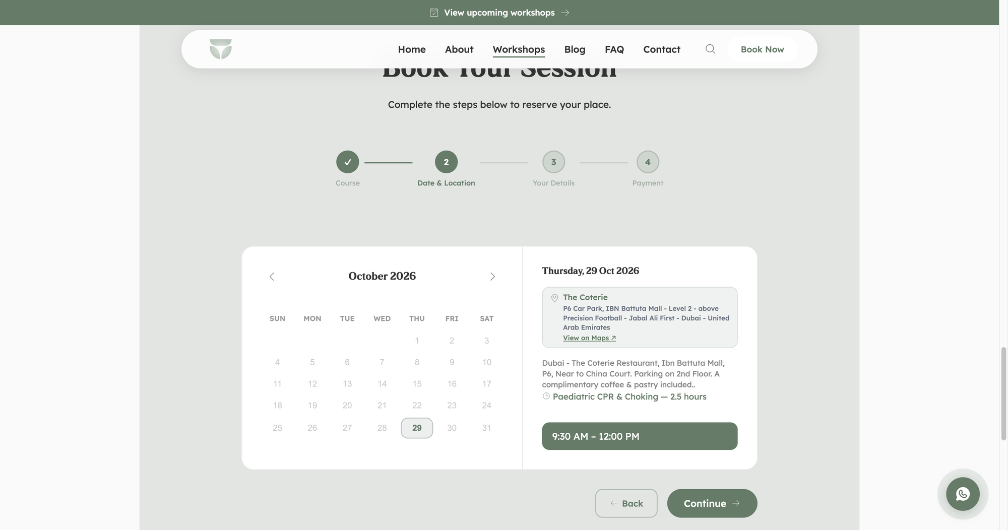
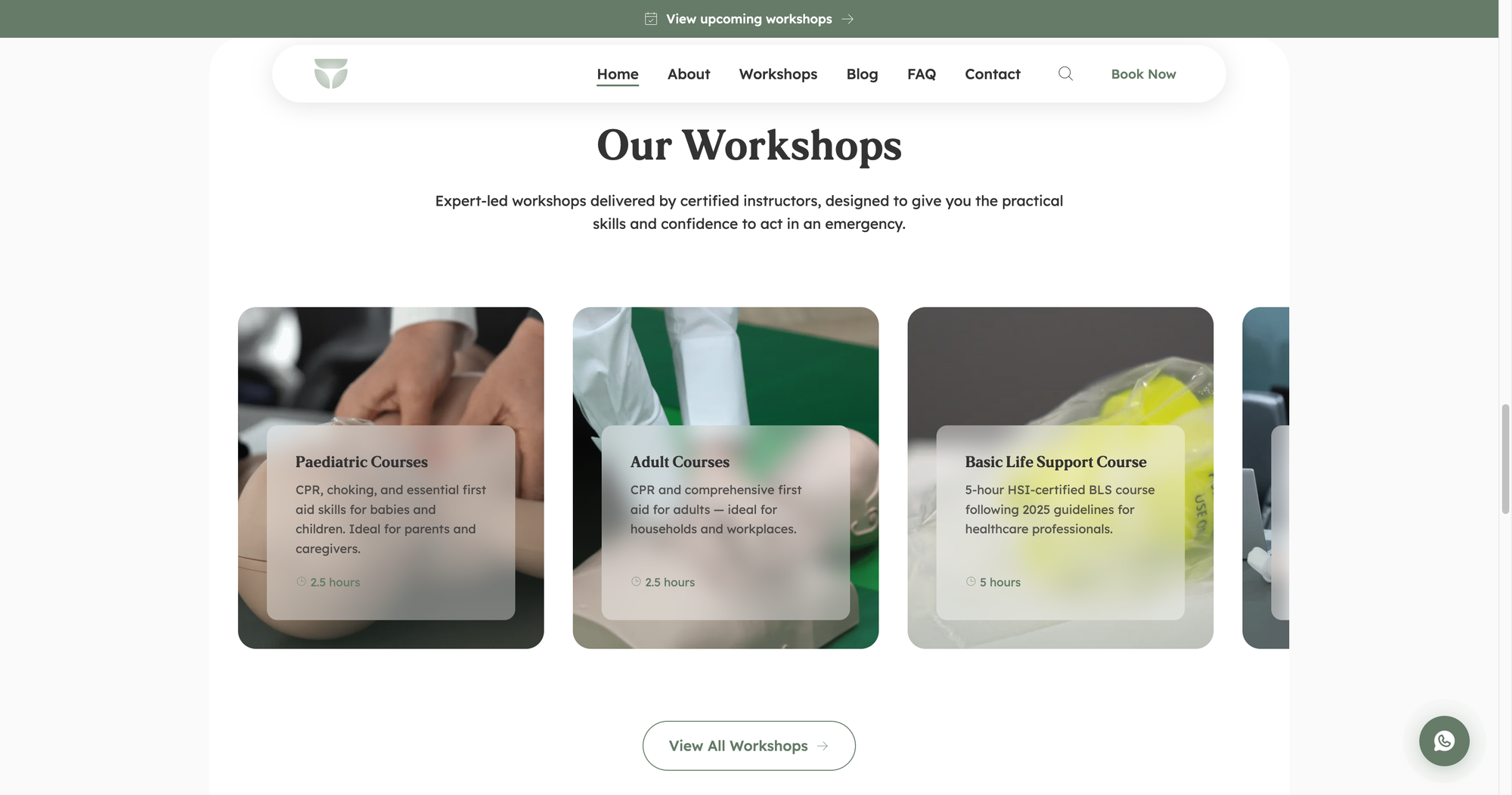
The site is organized around one action. A persistent Book Now sits in the pill navigation, a banner points to upcoming workshops, and the booking itself is a four-step flow: course, date and location, your details, payment. Each step shows only what that decision needs, and a summary bar carries the choices forward so nobody has to remember them.
Instead of: a brochure site with an inquiry form, which would have meant confirming every place by hand from day one.
Build it into WordPress so the client runs it
Courses, dates, venues and prices change every month. Building the booking system into WordPress means the client edits those as content, while the design system keeps every new page consistent with the brand. Maintenance is a retainer, not a rebuild.
Instead of: a custom application, which would have been faster for me and a dependency for them.
What I built
A booking system with real rules in it, and the design system that keeps it coherent as the client adds to it.
A four-step booking flow
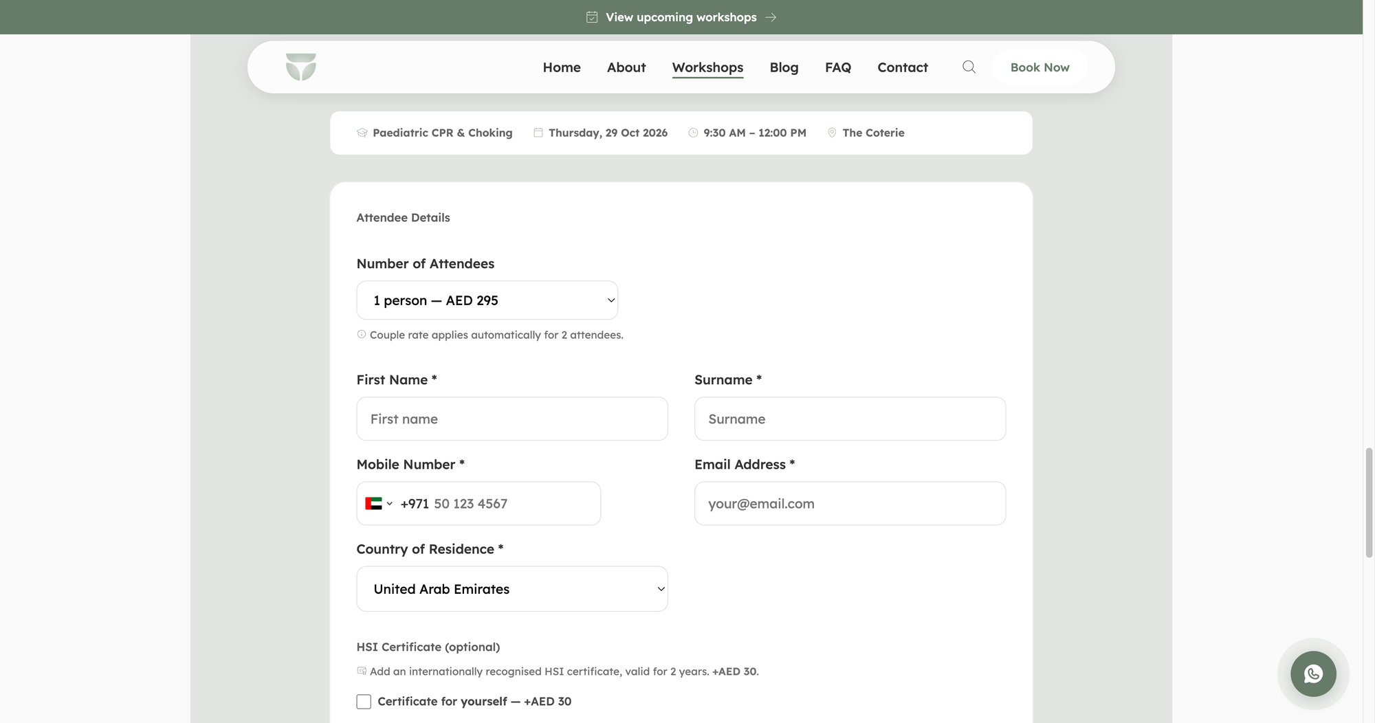
Step one chooses a category (pediatric, adult, BLS) and a focus area, with duration and price on the card. Step two is a calendar with only real sessions enabled, the venue with a map link, and the time slot. Step three collects attendee details. Step four takes payment.
Pricing rules that apply themselves
A couple rate applies automatically when two attendees are selected. An optional, internationally recognized HSI certificate is a checkbox add-on with its own price. The phone field carries the UAE dial code by default.
A design system in WordPress
Pill buttons, labeled fields with a sage focus ring, thin-stroke icons, numbered steps, an FAQ accordion and the cookie-consent toggles, all built as reusable components so the client's new pages inherit them.
The small things that keep people moving
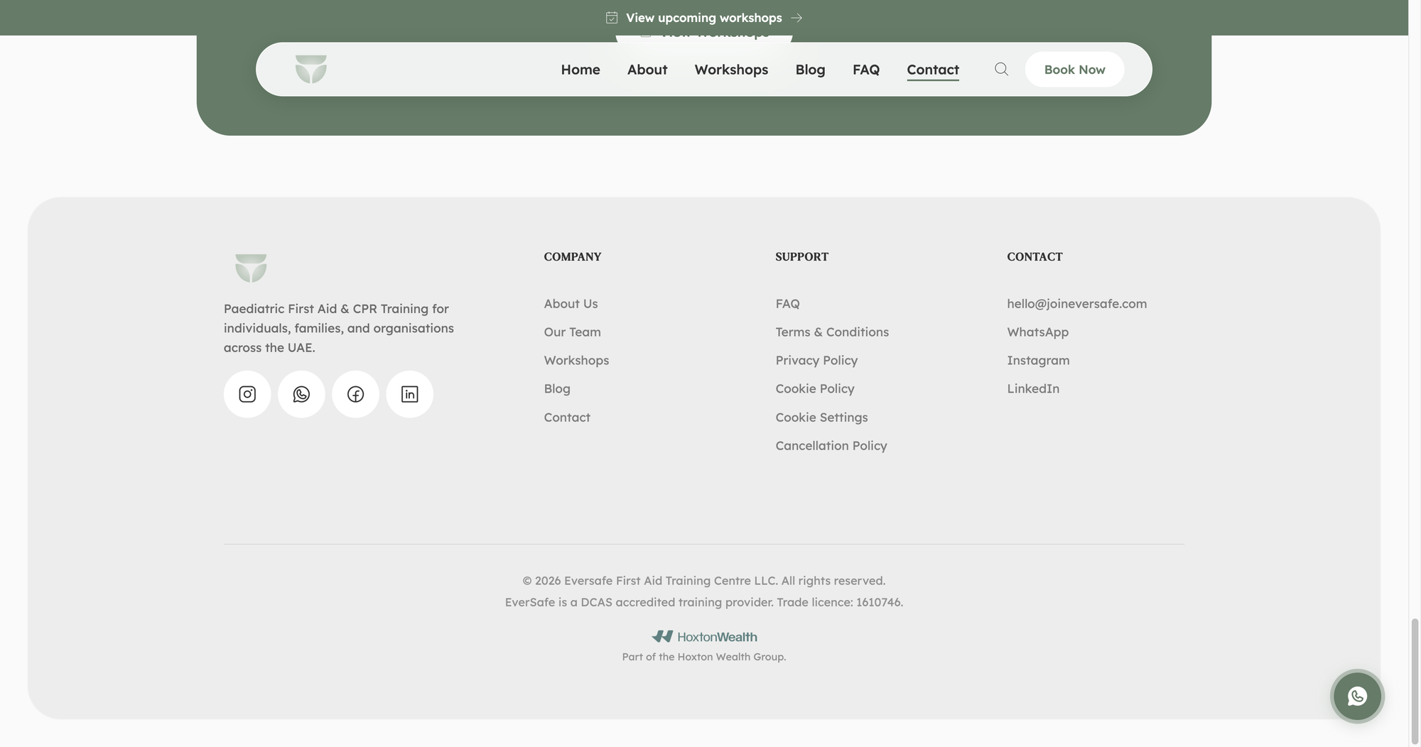
A floating WhatsApp button for the one question that would otherwise stop a booking, course cards that state duration and price up front, and a footer that carries the accreditation, the policies and every contact channel so trust is answered before anyone has to ask.
What shipped
Live at joineversafe.com, used mostly on phones by parents booking a weekend session.
The brand and the website
The identity and the booking platform were designed in the same pass, which is why a button on the payment step and the logo feel like the same decision. The components below are rebuilt from the site's own stylesheet, so every state is the real one.
The identity is built on the psychology of stability. The mark is symmetrical and bottom-heavy, like balanced stones, leaning in like a shield, with its inner shape softened into petals: structural strength, softened by care. A serif display face, LT Cushion, carries the emotional headline moments, and Lexend handles everything functional. Sage is for action, warm neutrals are for calm.
Labels above, sage on focus
Fields are white with a light hairline and 12px corners. The focus state is a single change: the border turns sage. No glow, no shadow, nothing that competes with what the person is typing.
Choices in the booking flow are cards, not radios. The selected card gets a sage border and a five percent sage tint, which reads at a glance on a phone.
Phosphor, thin weight
One icon set, Phosphor, always in its thin weight, always sage. The thin stroke matches the serif headlines and keeps the icons from feeling clinical, which matters on a site about emergencies.
WhatsApp gets its own mark because in the UAE it is how most people actually book.
Cards that carry the schedule
The announcement bar sits above the navigation and always points at the next workshop. Session cards lead with the date because that is the first question, then the course, time and venue with their icons.
The FAQ is an accordion with no border between question and answer, only a caret that turns. Hover and open states change color, never position: the site does not move things around.
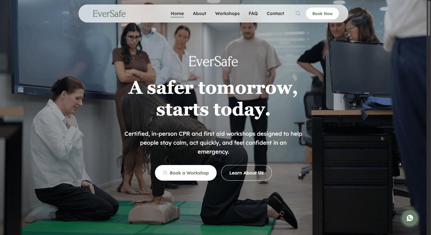
Certified, in-person CPR and first aid workshops designed to help people stay calm, act quickly, and feel confident in an emergency.
A serif for feeling, a sans for function
LT Cushion carries the emotional moments: the hero line, section titles, the big date on a session card. Lexend does everything functional, from buttons to body copy, because it was designed for reading ease and stays legible at small sizes on a phone.
Eyebrows are Lexend in small caps spacing and sage, the only place type takes the brand color.
Sage for action, neutrals for calm
Sage is the only color that asks for attention: buttons, icons, focus states, the announcement bar. Soft sage and warm sand are for surfaces and tints, so a page can have depth without a second accent.
Charcoal rather than black for text, off-white rather than white for the page, because the whole brand is about lowering the pulse.
What happened
Live and taking bookings
EverSafe is a DCAS-accredited provider, and the platform sells its pediatric, adult and BLS courses with online payment. A place can be booked and paid for without anyone handling it by hand.
An ongoing partnership
What began as a launch became a retainer. EverSafe is a recurring client on maintenance, and the site evolves as the course list does.
What I would measure next
Completion by booking step. The flow was designed to show cost early and ask for details late; the next step is instrumenting it to see where people pause.